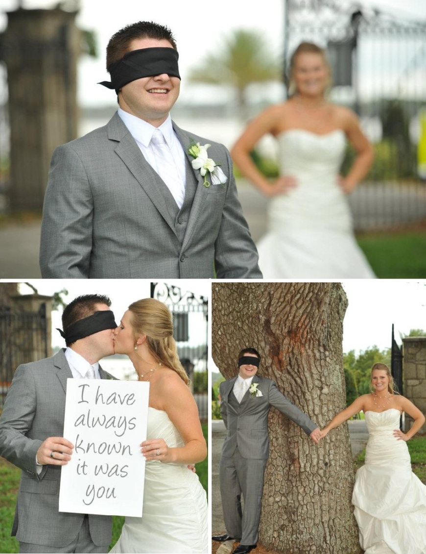
I’ve always known it was you Pt. 2

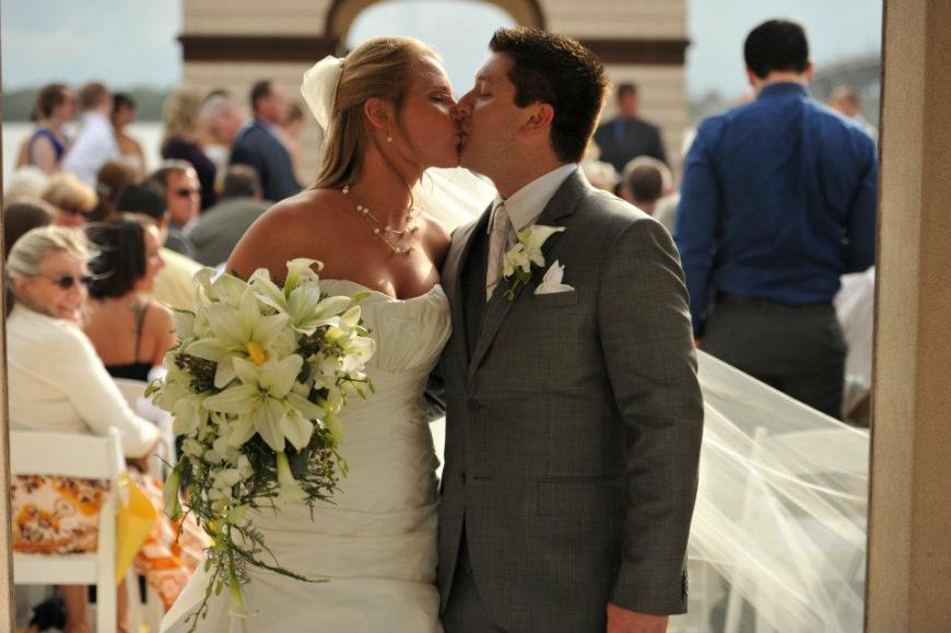
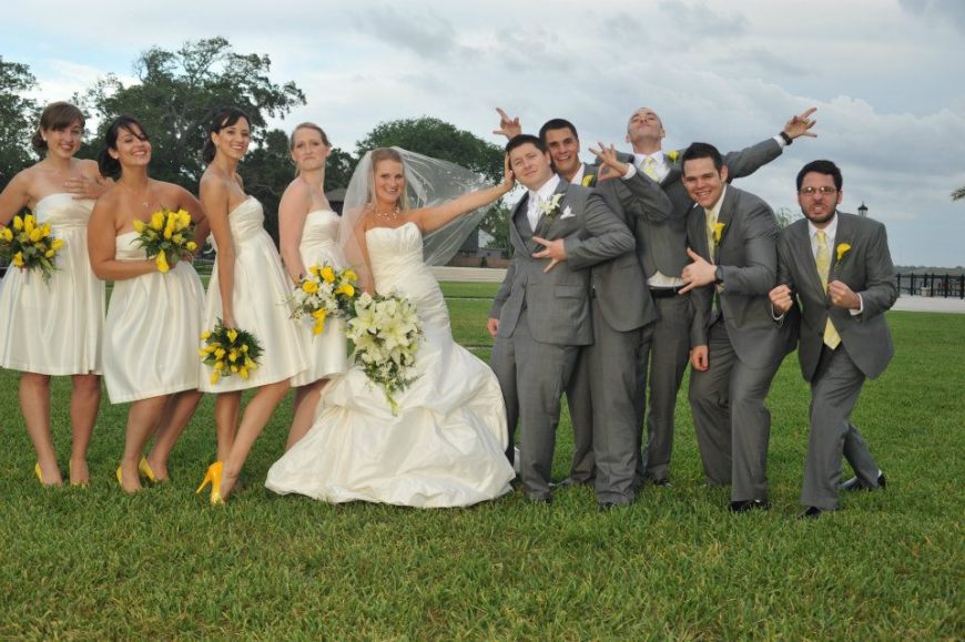
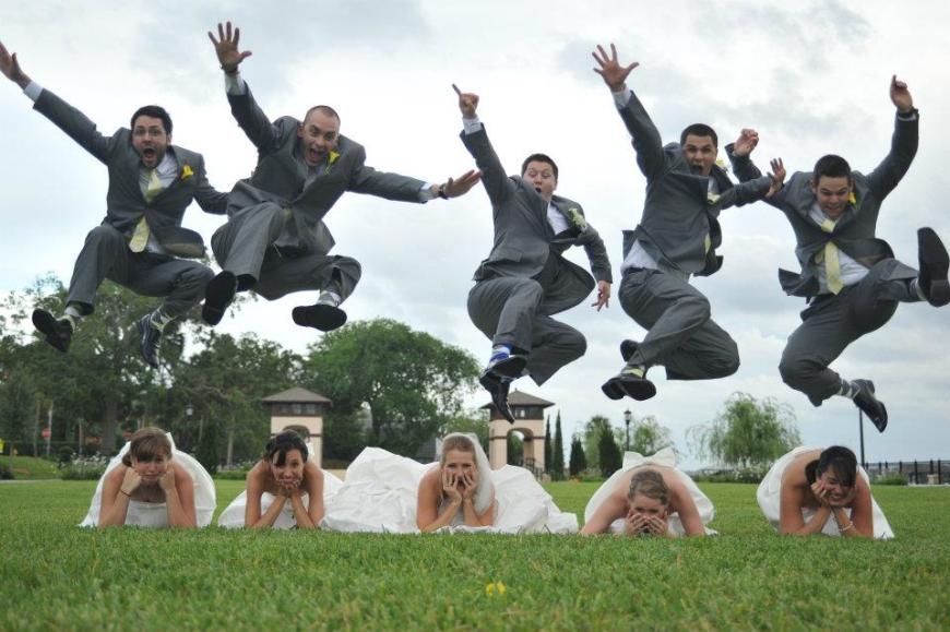
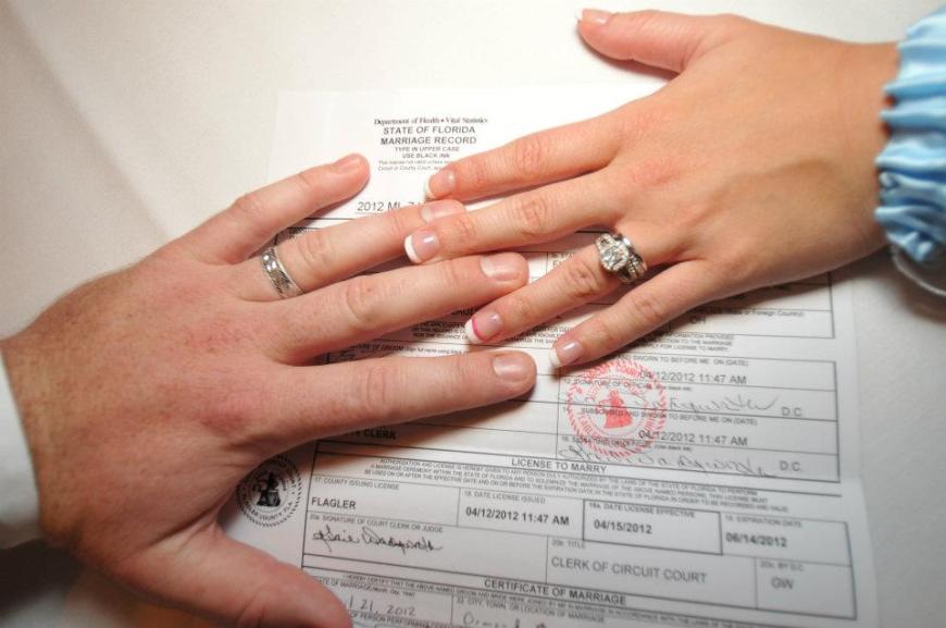
Well, as promised, it’s time to revisit the Ormond Beach Wedding. The professional pictures are in and they are fantastic. Seriously, there were so many beautiful images it was hard to pick out just a few to spotlight. The ceremony was held at Rockefeller Gardens with the reception following at Plantation Bay Country Club, both in Ormond Beach, Florida. Despite reports of thunderstorms we were blessed with clear skies and a nice breeze long enough for ceremony and pictures. All photos were taken by the talented AJ Neste who is such a blast to work with! (I apologize in advance for the oncoming photo overload!) Without further ado…let the ooh’s and ahh’s commence!

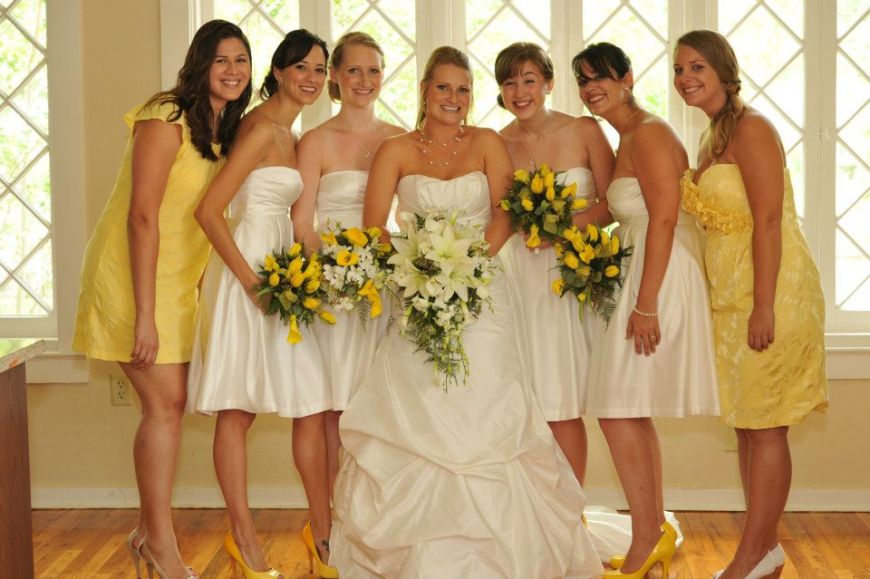
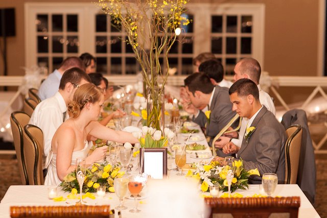
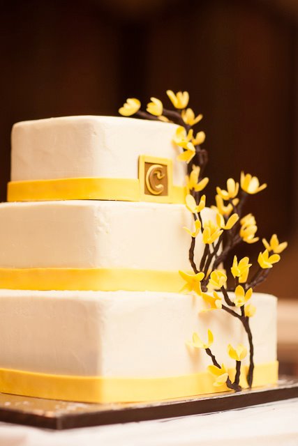
Using the forsythia blossom as inspiration Jaclyn and Ryan chose yellow, grey and white as their colors which were continued throughout the day. Guests were entertained with an acoustic guitar and cello during the ceremony by friends of the couple. All of the flowers were provided by Petals and Nature Scapes in Palm Coast and Parrish Designs of Miami. The reception was filled with willow and oncidium orchids, tulips, hydrangeas and calla lilies. Guests were greeted at the reception with a signature cocktail punch and a photo booth set up by the father of the bride. Shopping around for months, the bride found a vintage type writer through a friend so guests could write notes and well wishes to the couple. Guests were sent off with personalized bottles of olive oil put together by the bride and groom.

(From the bride) “They say it goes by quickly, but you can’t imagine.  The waiting feels endless — especially when you are engaged for a year in a half — but the last few minutes soared by me before I could catch a breath.  There was so much riding on one day, All of those tiny, minuscule details for a five-hour show.  But I wouldn’t change a thing.

I was so incredibly nervous about all the details coming together.  I had flowers for the reception coming from two places, and the ceremony flowers coming from another.  The aisles were lined with bows handmade by a friend and petal cones that I threw together. I had a groomsman flying in the day before the wedding, without his suit, praying that Penny’s would have his size.  It was chaos — brought together by one of my best friends, and wedding planner, myself & the groom, and my parents, who had been wonderfully helpful throughout the whole process.

So it came down to the final minute.  I walked down the aisle.  I said my vows.  I took the obligatory photos and some rather hilarious ones.  I rode in a limo to the reception.  Danced to our song.  Cut the cake.  Smile and hugged like my life depended on it.  And then it was over.  It was a massive, yellow blur for the most part.  I remember flying to St. Lucia for the honeymoon and thinking that I couldn’t wait to see pictures because I couldn’t remember how everything looked. I was praying that it all came together like I imagined.  

It honestly wasn’t until I got to see the photos that I realized how perfect everything was.  The flowers matched perfectly and created a beautiful backdrop.  The DJ was fun and entertaining and the pictures of everyone on the dance floor show my friends and family having a fabulous time — including my 80-year-old grandfather.  By the last photo of the night, Ryan & I have our heads pressed together and I look truly exhausted and truly blessed all at the same time.  And that’s what I felt. Everything fell into place and I was surrounded by beautiful things & beautiful people for the whole night.”

All of the little details added up to a spectacular wedding! Congratulations again to Jaclyn and Ryan!


Color of the Year

First off, let me blanket statement an apology for being MIA for well, almost a month pretty much. I’ve been a bit tied up with work, holidays and vacation. YAY! (more on that later) But alas, I am back and preparing for the new year. 2011 will be a year of big plans for me – though I will not be making resolutions because I hate those. I read a study the other day that said of the people who make new years resolutions 14% of them are more likely to fulfill their goals for the year vs. 3% of those who don’t make resolutions who fulfill their goals. Interesting right? I digress…

It’s pretty typical for weddings/social events/fashion or really anything to follow the trends of the year. We always have those lovely reminders of grandma’s wedding bonnet and our parents poofy dress sleeves to remind us of the trend of the decade. The design world is no different. Every year Pantone, aka color mecca, comes out with a color of the year. Some past ones include:

source

The mimosa shade of yellow was pretty common in the wedding world last spring in the grey/yellow combination (still makes me swoon every time I see it). Tourquise was poppping up everywhere right around summer time, so I’m sure you’ve seen them both. I’m a little behind on the post but 2011 has just recently been announced. Drumroll…

Honeysuckle! Of the pink variety that is. You can read all about the announcement here courtesy of none other than Pantone (I really do talk about them alot don’t I? Maybe I should find a new obsession ha). I could not be more excited. This fuscia/cranberry/pink esque color is one of my favorites. It’s a color to “lift the spirits.” Who doesn’t want that on their big day?

Now, depending on where you look the shade variety might vary but I like it all the same. Color combos are immediately popping into my head. Honeysuckle with grey, or yellow, or navy. Like so: (please excuse my paint skills, I’m on a pc 😦 ug. )

In a bit m0re elegant of a manner it could work. so I put together an inspiration board (very roughly and on paint again – excuse the slop):

You get my drift. It’s a color scheme that could be dressed up or dressed own. Quite frankly – I’m excited to see what become of honeysuckle in the 2011 wedding world!

Craving for a while

I can’t really call this a “today I love” post, because I’ve technically been crushing on it for some time; I’ve just never gotten around to purchasing. 😦

Behold – the love child of my two obsessions (weddings and design obviously):

brought to you by Dessy. It’s like a color flip book for weddings. I feel like I’ve been wanting this for so long that I’ve probably already blogged about it – but I can’t get enough of its glory. One day – it will be mine – that is if the price stops going up. ug.

Today I Love…

The Test Color Quiz.

One of the many blogs, How About Orange, posted this a while ago but it got lost in the commotion of my google reader. I finally rediscovered it today and OMG! HOW AMAZING! (click image below to try it out)

Naturally the psychology side of me loves all things personality, so I really get a kick out of this. Basically, you pick the colors you like then the ones you don’t and it spits out a personality profile about it. It was spot on. These are some of the things it said about me:

  • you are a creative person, with always new ideas, and you know how to apply them.
  • You are intellectual and intelligent, you wonder and you inquire before taking any action and setting your values.
  • you are thoughtful and deep, you think before getting into action and you know how to communicate your knowledge.
  • you are creative, you know how to see beauty, you are intuitive and your inspiration comes from the inside.
  • you are a manager and a structured person, you know how to take into account the needs of each person while leading them to the fixed goals.
  • Finally, you are a manager and a leader, and you know how to organize groups of people and how to give them your energy, you are attuned to others and you show a good emotional intelligence, which allow you to give support to people.

It also said in relation to understanding my environment, I am more emotionally related. I rely on my inspiration for influence more so than social ties; my decision making is motivated by my inner conviction, and my actions/behaviors are determined by my sensibility and that of my partner

How fun! I love these things. I think this bodes well for my future endeavors. If anyone decides to try it I am interested to see what your results are: Leave some comments!

Paint the town Red

If you have picked up any magazine recently you may have noticed that the new color of the season is Red. Bright Crimson Red. (Jewel tones, with a bit of a brighter twist, also seem to be popping up everywhere.) I always find it interesting how design trends follow fashion and colors on the runway creep into interior design, graphic design, and obviously event design.

This is not the best quality image – but the below picture is from one of my favorite books of the moment, the Visual Miscellaneum, made up completely of info-graphics. This particular one is showing the Pantone colors of the season for the past few years.

So Fun!

Anyway, Pantone is the design color mecca, but if you look at the Spring 2010 (the last portion of the rainbow) there are more than a few colors that were popular in the wedding world. Since Red is such a striking color I am very interested to see how it appears this coming season. I personally picture it as more of an accent, but it can definitely play center stage in the right setting.

I tried to find some good photos, but it’s late and i’m tired so…here are some of the combinations that I’ve seen a lot lately:

Red and tan or camel (think: gold hued bridesmaids dresses with red Gerbera bouquets? love). The good thing about this combo is that the tan color tone can mellow out a bright red very easily.

Red and teal (a very vibrant version of teal was also a fairly popular color last season as well – toned down a bit it would be a nice classic combination). This screams a fun party to me.

Red and purple (again purple was a HUGE color for the spring season, so this would be an awesome way to use it as an accent and phase it out. Cranberry and plum anyone? Sidenote: we will be bringing in a touch of red to pair with the dark plum in an upcoming event I’m doing; glad to know it won’t be outdated 🙂 ha)

The good thing about having a bright color pop like red is that it really goes with any thing. Red and black is very classic (Audrey Hepburn – black dress, red lips), I think you could even get away with a darker red mixed with a pink hue of sorts…

hmm…something to consider. Anyway, colors make me happy, and the turn of the season is always exciting for me – waiting to see what’s next on the horizon! Not to mention – I am obsessed with all things Pantone!